

Announcing Infervision's New Brand Identity

Why the New Look?
We are pleased to announce the launch of our new brand identity, including our new logo! Our current branding has been performing well for the past 5 years, but now it’s time to go to the next level. Infervision has gone through 5 years of successful efforts in the field - from the initial vision in medical A.I. by Infervision's founder and CEO Chen Kuan to the full-scale global team we now have in 2020 to help the world fighting the COVID-19 pandemic. We know rebranding would be a balancing act, but our goal was to convey that this was a new brand identity, without departing from our original vision. We have retained the symbolic "water" and "waterdrop" element in our logo trying to maintain a certain degree of consistency when picking the new color palette.
The healthcare artificial intelligence space continues on its rapid development with almost daily innovations. Infervision, as a global pioneer in the healthcare A.I. field, hopes to establish our footprint with a simple, intelligent though elegant, and classic image that matches our presence and value to the profession. Infervision’s goal is to make human lives better with AI-assisted healthcare. Our new logo, seeks to communicate these key values.
Infervision is dedicated to the further exploration of excellence in healthcare A.I. from the technology, its applications, and ultimate value to the clinician and patient. Infervision will strive to continually improve healthcare screening, disease detection, diagnosis, and treatment capabilities for the improvement of human life. At the same time, our research will dig deeper into the clinical application of AI to develop solutions from the single disease at a single department to multi-scenarios and multi-department. Going forward, with the goal of "Advancing technology, Inspiring healthcare," Infervision will develop more opportunities and generate innovative insights for the healthcare industry; propelling the company and its clients into the "Intelligent Healthcare" era.
The Meaning of the New Look
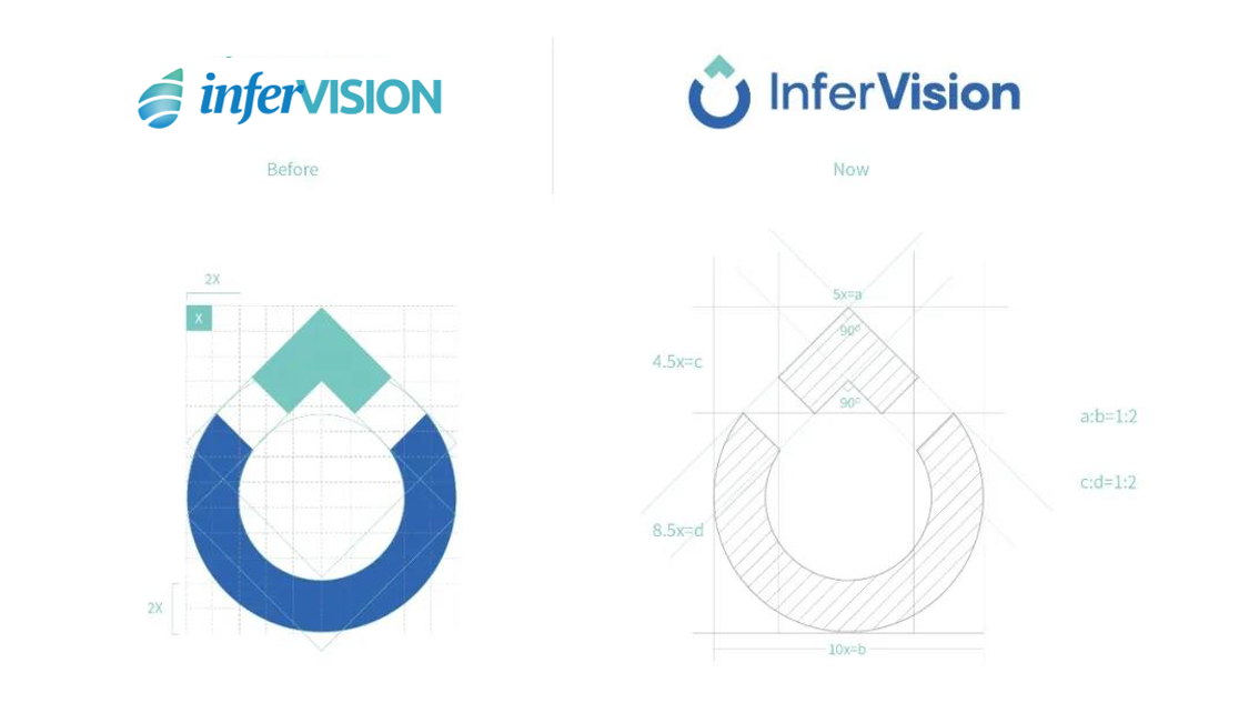
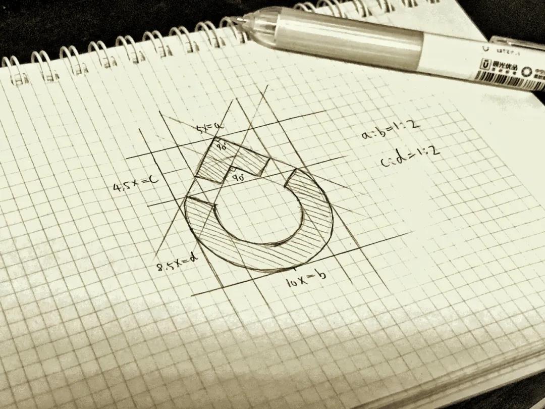
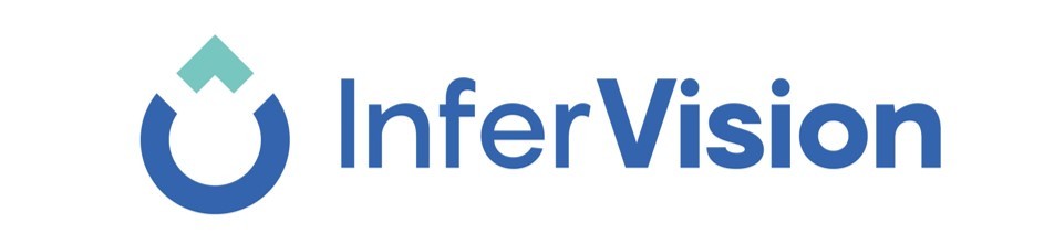
With weeks of design and planning from Infervision's design team, we are pleased to announce Infervision's new brand identity. The new logo reflects an integration between the waterdrop and the capital "V" from Vision. The overall waterdrop shape symbolizes water with an implied meaning of life and health. The "U" shape arc at the base adds the elements of smile, happiness, and achievement.
The top “^” of the new logo symbolizes the stability, which fully reflects Infervision's value to work steadily and perform solidly with constant self-improvement and evolvement.
As with any logo, we want it to convey everything that Infervision stands. The new logo stays true to our roots while also symbolizing our dynamic future and our mission in the healthcare A.I. space. The Infervision team is very excited about the new branding identity and we hope you like the new look and feel of Infervision! And we look forward to having you join us in our future journey.
Company
Focus on

Copyright © 2023 Infervision Medical Technology Co., Ltd. All Rights Reserved.
SEO Tags | Business License | Power by: 300.cn Beijing